As a large cap index all the constituents of the S&P 500 are highly liquid. This is certainly true compared to mid-cap or small cap stocks. There are, though, high, and low rent districts within the S&P and the most liquidity is concentrated in a few stocks with the largest market capitalizations. We treat large-cap stocks differently than mid-caps when thinking about trading strategies largely because of their different liquidity profiles. Should we consider making similar distinctions within the S&P 500 itself? Understanding variations in the liquidity characteristics of different S&P 500 stocks can help determine the optimal participation rate of a trading strategy, and so, assist in obtaining best execution. Here we look at 4 sets of stocks at different levels of market capitalization within the S&P 500.
Key Points:
- The most highly capitalized stocks obviously have more quoted liquidity in absolute terms. However, as one is willing to pay more for liquidity, the rate of change in quoted value increases faster for less liquid stocks.
- During the trading day there is an increase in quoted value after the Open in all four liquidity groups of stocks. There are significant differences in the size and the speed of the increase in liquidity between the different groups. The least liquid group has the largest gain over the day and the most liquid group has the smallest increase.
- The amount of daily liquidity quoted each day is reasonably consistent across all the groups of stocks we measured.
Methodology:
An interesting thing about measuring liquidity is that it can only be known after the fact. We colloquially speak about liquidity in terms of ease in buying or selling. The actual amount of liquidity, however, is only determined after the transaction is completed. Liquidity is always available – at a price. Liquidity denotes how much one would have to pay to convert an asset into cash. The cost of liquidity is the clearing price for converting the asset into cash. Here, we compare four groups of stocks. The “Most Liquid” group are the most highly capitalized technology stocks (Facebook, Apple, Amazon, Microsoft, and Google). They make up approximately 21% of the index’s market capitalization. The next group is comprised of stocks in the range of the 25th – 50th most capitalized names in the S&P, these include MacDonald’s, Walmart, Nike, Cisco, and Phillip Morris. Together, they constitute 2.5% of the total market cap of the index. This will be referred to as the “Top Tier” Liquidity Group. The group with mid-tier liquidity is comprised of 5 stocks which together are 1% of the S&P’s market capitalization. The “Bottom Tier” group are among the smallest 25 stocks in the index in market capitalization. Together they make up .01% of the overall index. Our data set is all market data including all venues and levels of the Order Book from October 1, 2020 through May 14, 2021.
Our underlying metric is “average X bps liquidity”. This metric measures the total quoted dollar value available within X basis points of mid-price. Obviously not all quotes are genuine attempts to trade. For purposes of this model we assume that quotes are generally sincere indications of interest in trading. We then use the “average X bps” metric to determine the rate of change in quoted value when moving further down the order book. We measure “X” at a series of price points: 1 bps, 5 bps, 10 bps, 25 bps, and 50 bps by calculating the value available at all venues and at all levels of the order book in 5-minute windows. To measure the change in quoted value from, for example, 5 to 10 basis points from the Mid, the formula is simply: ((SUM ([Average 10bps liquidity]) / SUM ([Average 5bps liquidity]))- 1 ) * 100.
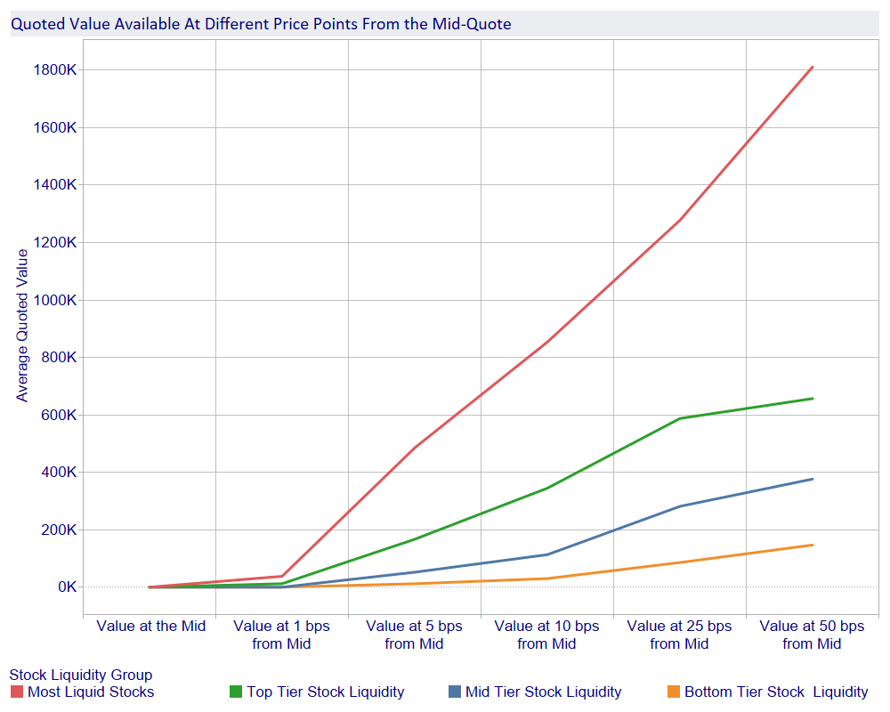
Figure 1 (below) shows the average amount of liquidity available at different price points away from the mid. As expected, there is much more quoted value available for the “Most Liquid” group of stocks. What is perhaps somewhat surprising is the relatively small amount of difference in liquidity between the mid-tier and the bottom tier stock groups until one gets to a quote price 25 bps away from the mid.
Figure 1
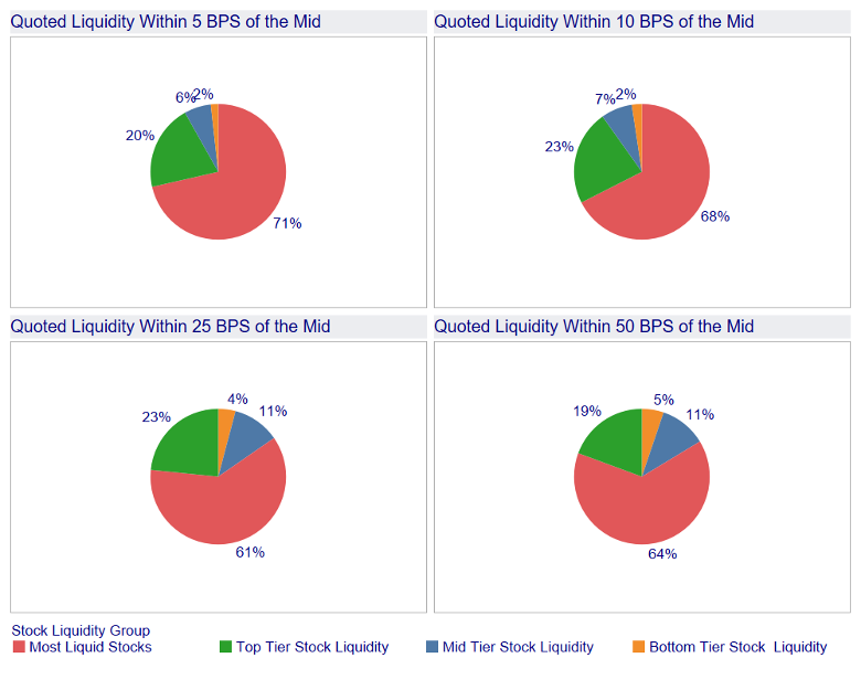
What is interesting in Figure 2 (below), is that, as the price one is willing to pay for liquidity rises, the percentage of quoted value in less liquid groups grows relative to the overall total. As quoted prices move further away from the mid quote, the overall percentage in the “Most Liquid” category declines. The “Top Tier” group peaks as a percentage of total quoted value around 10 basis points from the mid quote, while the percentage in the less liquid groups increases.
Figure 2
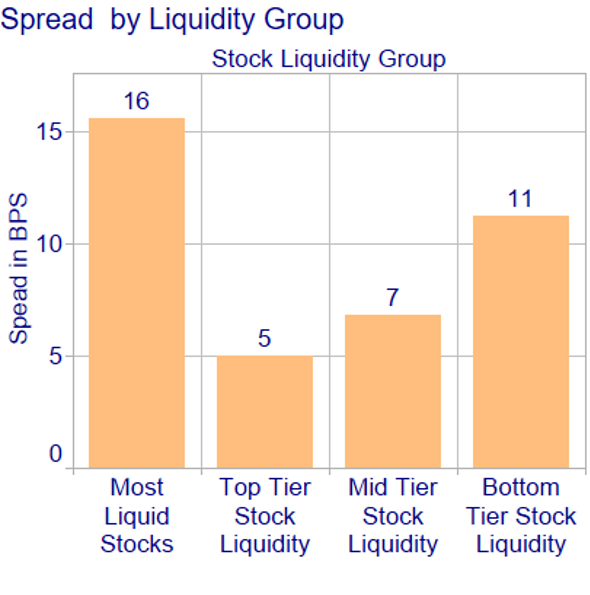
It might be supposed that the increase of relative value in the less liquid groups is the result of these stocks having wider spreads. That is, however, not the case. Figure 3 below shows the average spread for the period. In fact, the most liquid stocks have the widest spreads because of the volatility in the Tech sector in early 2021.
Figure 3
Knowing the overall levels of liquidity present at different price points is useful, but equally important to understand the liquidity of a stock is the rate of change in quoted value as you move between price levels. That is, how much more stock can I buy if I am willing to pay a higher price. To put it another way, what is the price of participating more aggressively if I choose, by accessing liquidity further down the order book?
Figure 4 (below) shows the percentage increase in quoted value for each stock liquidity group as you move from quotes within 5 basis points of the mid to 10 basis points from the mid and further. As the cost of liquidity increases from 10 to 25 bps, the percentage by which quoted value grows starts to decline for the “Most Liquid” and “Top Tier” stock. In contrast, the rate of increase for quoted value is still increasing at these price point for the less liquid stock groups.
Figure 4
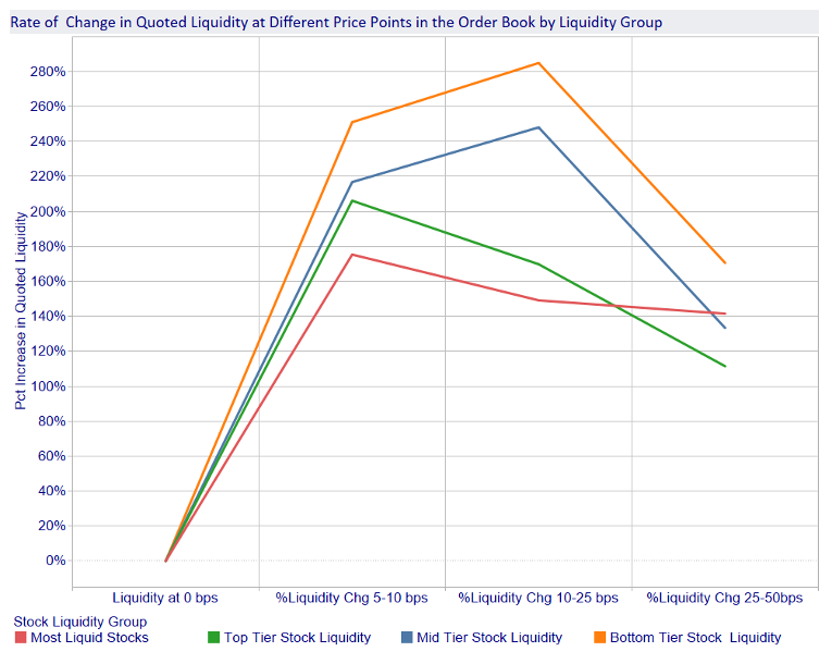
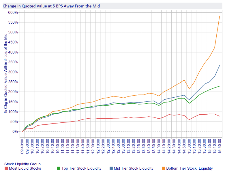
Does the rate of change in available liquidity shift similarly for the different groups over the course of the day? Figure 5 (below) shows the intra-day percentage change in liquidity for these stocks. We measure the available liquidity within 5 basis points from the mid as our benchmark in 10-minute intervals from 10 minutes after the Open to 10 minutes before the Close[3].
All liquidity groups exhibit the same pattern of an increase in liquidity after the Open and then show a further gradual decline in quoted value throughout the day. The “Most Liquid” stocks have the slowest rise in available liquidity across the day, while the less liquid stocks have the fastest growth in liquidity.
Figure 5
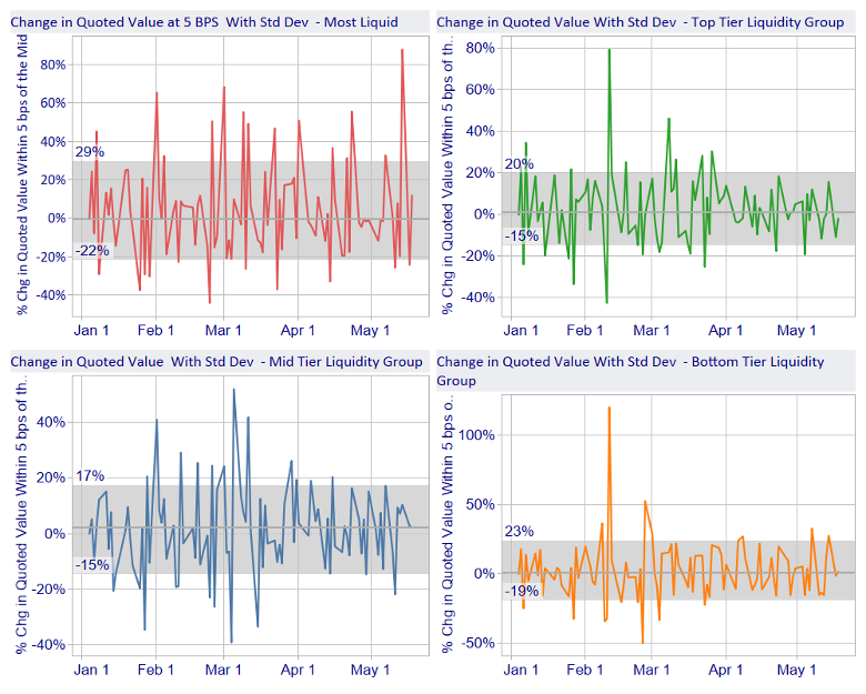
If we want to use the shifts in liquidity as a decision point in refining our trading strategy, we need to consider what is the variance of these outcomes? Figure 6 (below) shows the standard deviation of each day from the prior day of the liquidity within 5 basis points of the mid from January 4, 2021 through May 14, 2021. Across all stock groups the results are similar around +/- 20% change. The widest dispersion of outcomes is in the most liquid stock group reflecting the volatility in the Tech sector earlier this year. Nonetheless, the variance is sufficiently tight to be useful in anticipating liquidity behavior.
Figure 6
In determining the optimal level of aggressiveness of a trading strategy, the rate at which available liquidity changes can be a valuable decision input in estimating the cost of increasing the participation rate. It is important to have this information on a stock by stock basis rather than applying a broad-brush classification such as “Large Cap” stocks, as well as being aware of patterns of liquidity change over the day. A participation rate which is too high can lead to unnecessary price impact and information leakage. An overly conservative participation rate can result in lost opportunity costs. Information about overall liquidity and the rate of change also has applications in areas such as evaluating algo wheel performance to ensure a proper “like to like” comparison among different strategies.
By Henry Yegerman, Associate Director, ISS LiquidMetrix
